Skunk Spray Paint Brand Product Triptych
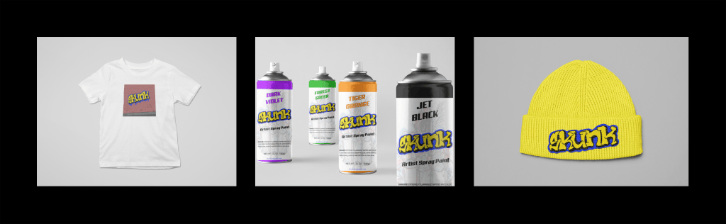
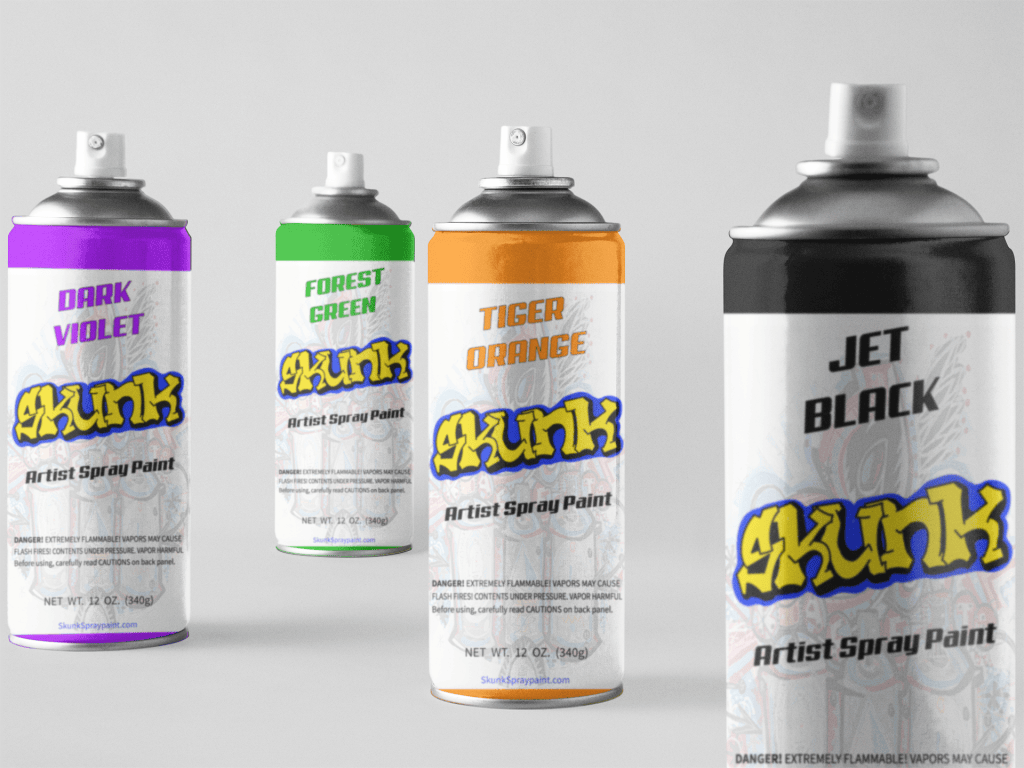
This project explores branding and packaging for a spray paint line built for a younger generation of graffiti artists. The design centers around a bold, hand lettered logo inspired by graffiti typography that’s meant to feel authentic to the street art culture it’s created for. The can itself balances creative expression with functional packaging: alongside the branding, it includes the standard elements any spray paint product needs; hazard warnings, color indication, and volume integrated seamlessly into the overall design rather than feeling like an afterthought. Spray paint was chosen specifically for this concept because of its versatility as a medium, making it a natural fit for a brand built around artistic freedom. The process began with hand-drawn sketches to explore lettering styles and composition, followed by digital refinement on iPad to experiment with color and detail. From there, the design was finalized in Adobe Illustrator, where the product label, packaging mockup, and an accompanying merch line were developed. The clothing design extends the brand’s identity with a graphic of the logo spray-painted onto a brick wall reinforcing the street art aesthetic at the heart of the concept.